Our logo design service takes around two weeks to complete. This timescale covers the time for our team to research your business and industry as well as to design your bespoke concepts.
Our bespoke service is affordable and the quality that you receive both in the logo that we create and the service that we provide is hard to beat.
We are sure we will create something that you will love, no matter how complex or minimal your brief is.
We’re experienced in a wide range of business sectors, so we're sure we will be able to interpret your vision and design exactly.
Certainly not. Once we have designed your new logo, it's yours to keep. You have ownership over it.
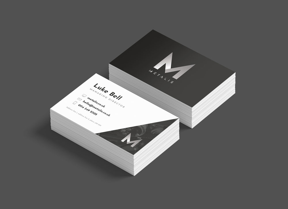
Yes, you can. Our logos are vector-based so they can be enlarged to any size without quality loss (pixelation).
A vector-based logo can be utilised by an embroidery company to allow them to stitch your logo onto workwear.
Of course, we have designed many logos without a brief being provided. Our team is creative and would only need to know your business name and what you do as a minimum requirement to create a new logo.
We would suggest our premium package if you don’t have any ideas for your new logo. This allows our team to create four concepts for you to provide a good selection of bespoke logos to choose from.


 View article
.jpg)

